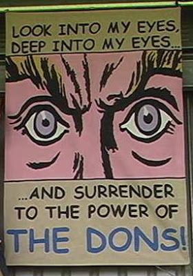
Thursday, 27 September 2007

12. Composition on Blue (‘Feel the Force’)


Stylistically ‘Feel the Force!’ harks back to classics such as ‘Look into My Eyes!’ and ‘Nice Clean Sheets’ with its use of bold colour, bordered and contrasted with strong blocks of black. It is a style that Fleydon finds both comfortable and emphatic

“For this work I wanted to get back to basics somewhat, to remove the imagery and, dare I say it, the intellectualism of more recent works. As an artist I am also somewhat of an angler – I have to hook my audience and play them like a fish. If they are biting I have to keep them hungry – I mustn’t overfeed them or they’ll loose interest. ‘Feel the Force was a direct appeal to those viewers that come along to the Cherry Red Records Fan’s Stadium Kingsmeadow not only to view my work, but to look at some of the football as well. I wanted to KISS them!”

Fleydon threw back his mane of dark, tightly curled hair and laughed at my surprise

“Not physically of course, although I would certainly make an exception in one or two cases. No sometimes I need to Keep It Simple for Supporters. It’s chicken broth art…”

Chicken broth it may be but Fleydon did risk alienating his audience with his outburst at the unveiling.

“In hindsight it was my fault but the canvas was the wrongs size. The players are mythic Titans striking the earth, literally causing the sparks to fly– they embody the unstoppable spirit of the club, an untamed primal force, lightening at the dawn of time. The tremors roll through the Tempest End and equate to the physical shaking as the crowd celebrate a goal. The trouble is that when hanging 'in situ' supporters obscure the key reference, the lightening flash. Instead it looked like two drunks leaning against each other, squashing little people. It upset me and I over-reacted. Pushing the crowd aside was not an appropriate response and I apologise for my actions.”

Those sadly injured in the ensuing panic and rush have since resolved their actions out of court and a level of equilibrium has once more restored to the terraces.

‘Feel The Force’ is still owned by the artist. It enjoys occasional hangings in the Tempest End(mainly during mid-week cup games) in the hope that one day it will be seen in it’s full glory.

Wednesday, 26 September 2007

12. Composition in Fur (Wombling Free)

Last season Haydon the Womble held an open competition to design a suitable flag to represent him to the wider public. The competition criteria was to 'rouse the crowd, to provide an ecological message and to be robust enough to always fly when the Womble was in residence'. As a result of a bet, Fleydon entered a canvas in the names of two promising youth players, confident that even without the prestige of his name that the quality of his work would win through.

“I had to change my style completely, of course” remarked Fleydon the quality of the fur and the texture of the cloths were, simply, outstanding. So much so that my two assistants found the flag more enjoyable to touch than the Womble! Of course I won – I never doubted for a moment that I would – but it gave me great enjoyment watching all the presentations, speeches and ceremonies, knowing that Fleydon was the real winner. The girls did well though and they had their five minutes of glory, even if it was windier than they found comfortable!”

Despite Fleydon’s eventual theatrical and highly embarrassing revelation of his true authorship, Heydon the Womble elected to retain the flag for official duties, mainly because as it later transpired Wombling Free had been the only competition entry.


Composition in Fur ('Wombling Free') appears with permission of Haydon the Womble and can be seen in the Tempest End at home matches.


Tuesday, 25 September 2007

11. Composition in Grey and Green (Behold the Don)


Behold the Don is one of Fleydon’s least regarded works despite being in his own words ‘a spiritual and divine attempt to capture the essence of the men behind the shirt. It is Football as a question, or rather a plea…’ However it is a plea that seems to have fallen on stony ground as it is regularly voted one of Zoo Magazine’s top five ‘Flag’s Fit For Burning’.


Fleydon seems to accept this as the price for
‘baring my soul a little further than was really necessary’ although he cannot help pointing out that he felt at least some of the opprobrium directed was because some were still convinced that the hair of the figure was modeled on that of Peter Winkleman rather than the actual model Luke Garrard. “If it was supposed to be Winkie I’d of done the hair in thick oils!” he chuckled in his distinctive West Country burr “but it was watching Garrard and his refusal to let opposing forwards pass that was the real inspiration.

‘Ecce Homo – Behold the Man’ were the words of Pilate as he threw Christ to the mob, and that’s what I feel like shouting as Garrard takes his place in the team. Behold the Don! He doesn’t normally have all those extra limbs of course – he is no Shiva the Destroyer – but they are symbolic of his determination that ‘none shall pass!’. However, I must concede that he does sometimes have an aura of grubbiness about him (hence his nickname ‘Stig of the Dump’) so I thought I’d put in a bit of grey around the figure, like an aura of soot enveloping a mighty steam locomotive!”

However many are left cold by the religious overtones within the work. Mr Garrard’s feelings on the matter are too well-known to bear further repetition and I was happy to leave this curio of a flag and to move on to other, more rewarding works…

Composition in Grey and Green (“Behold the Don”) remains unsold and is currently being used as a duvet cover by the artist

Monday, 24 September 2007

10. Composition in Yellow, Blue, Red and Green (“Attack on All Fronts”)


“The most potent memory I have of this particular works (one of my favourites by the way) is of the extraordinary lengths I had to go to in posing the models. I had jerry-rigged a ladder to the wall of my garage that leaned at the correct angle necessary for that feeling of dynamism that suffuses the whole canvas. The top two models held on to poles to balance and prevent themselves slipping off the rungs. That is why their hands are so tightly gripped - I had to paint the poles out. The poor boy at the bottom though had no such support and complained incessantly of back problems throughout the day.”

On its unveiling there was a degree of unease with the evident age and lack of fitness of the central character but Fleydon dismissed these issues with characteristic impatience “They are fools. They confuse symbolism with naturalism. Why the goalkeeper only had one leg so obviously he’s not meant to be taken literally as a goalkeeper, although that might explain why he complained about leaning so much. What I celebrate is a team of three facets –youth, man and behemoth. The behemoth is a centre-back with much experience in his last year as a player who is soon to be ‘away’ from the rest (and hence the choice of strip). Every side has one…every side needs one!”

Public opinion soon swung away from the critics and the composition soon found favour as a poignant allegory for the short life of a footballer


Composition in Yellow, Blue, Red & Green (“Attack on All Fronts”) is currently on loan to the Rt. Hon. D. Beckham and hangs at New Posh Towers, Los Angeles

Sunday, 23 September 2007

9. Composition in Blue and Green (“Raiders of the Rymans”)


“What” I asked Fleydon “are we to make of Raiders of the Rymans’? To me it looks like a populist attempt to cash in on a summer blockbuster film. It is not a work that has added to your critical renown, but you insisted that it be included in the exhibition. Why was that?”

Fleydon turned and faced me full on, fixed me with a firm stare and placed an arm on my shoulder. ”This work” he said quietly “caused me more angst, sweat and anxiety than any other. It is a work brimming with religious significance. If you look closely you can see the revisions, the changes the sheer frustration etched on the canvas. This is no pot-boiler, money-making attempt to fleece innocents but a cri-de-coeur.

I love this picture as only a parent can love a sick child. It struggles, and the cruel world laughs but they laugh at an allegory for the very club itself – Wimbledon rising, born again, a glorious resurrection!. Look, in religious painting the skull represents the transitory nature of life – in here it reflects the transitory passing of a club itself – the death knell of Wimbledon FC. The crossed bones often refer to the cross at Golgotha, ‘the place of the skull’, a place of death, but ultimately of hope and resurrection – the feathers are attributed to St Barbera’s home town of Heliopolis, the birthplace of the fabulous Phoenix – the golden yellow of the cloth represents the sun whose re-birth brings such joy to the world.

The grin of the skull? That obviously shows a triumph over death, a laugh in its face as it were. The scroll at the bottom is often used to represent old testament prophet’s who record wondrous prophesy - and what better prophesy than that of our beloved team writ large? And finally the hat – not a tricorn as many assume, but a black biretta, symbol of the priest who has the power to comfort and provide a path to salvation. And what emblem is depicted on that biretta? The two-headed eagle of Caesar who ‘came, saw and conquered’ – perfect!”

He stood back from the flag, tears in his eyes and emotion gripping his body. “My god what a flag - it has it all, the whole wondrous story on one sheet. THAT is the depth of emotion, of feeling and passion embodied in this picture, not some rip-off of a movie. That attitude makes me spit! Football is my religion, AFC Wimbledon is my denomination and the Cherry Red Records Fans’ Stadium Kingsmeadow is my church. And we will rise again, mark my words!”

As Fleydon’s face contorted with anger we paused for a while to allow the passion to subside. “And the legend ‘Raiders of the Rymans’ I asked, "does that have any religious significance?” “No, none…” he admitted “but my agent felt it would make it more attractive as a potential t-shirt design – at least until we are promoted.” He gave out a deep, bellow of a laugh “Of course I might be long gone by then! Clubs might be resurrected, but I doubt I will!”

Composition in Blue and Green (“Raiders of the Rymans”) is appearing courtesy of the Disney Corporation.

Thursday, 20 September 2007

8. Composition in Grey (“Raising Standards”)


“But please, let us forget Ms Tracy Eminem and her shallow female sexuality for one moment” said Fleydon, passing swiftly along the line, and let us concentrate on a real phallic symbol. War and Football – so often linked whether playing across the trenches, Christmas day truces or ‘Escape to Victory’ -the vigour of young men competing at their peak. ‘Erecting the flag’, yes… sex, combat and AFC Wimbledon this picture has it all. Look at the angle of the pole and the cluster of rounded shapes at the bottom – if you squint I think you will see the phallic embodiment of a rampant club. I shiver whenever I pass it. It’s symbolism is so powerful, so intense. The original photograph might have been quite well-known, but my re-staging has I feel, a more honest, earthy touch.”

I asked Fleydon if there was anything about the work that he would change. Well, one technical thing that struck me at the time was how tricky it is painting a fluttering flag on a fluttering flag! Creases, like faces, are a bit tricky…”

In an extraordinary statement, Fleydon then claimed to have proof that the original photograph, ostensibly of the capture of Iwo Jima, was actually staged in the desert of Nevada. It’s a conspiracy you know – and a cover up” He leant toward me and winked. “But I know the truth – Art opens both doors and tongues you know…!”

(Composition in Grey appears with kind permission of the Commanding Officer, Area 51, Nellis Air Force Base, Nevada)

Wednesday, 19 September 2007

7. Composition in Green (Clean Sheets)


Those with a taste for gossip and scandal will recall that ‘Composition in Green’ was the centre-piece of fierce, vindictive and very public spat. Tracy Eminem, linked by Hello! magazine to Fleydon and widely assumed to be his lover, declared her intention to see that stunted sod in the courts’. Fleydon, however had no qualms about clearing the air – “Of course it was about her – anyone could see that. I just upset the young lady with my refusal to be used as a stepping stone in her career. As a far superior artist it was only natural that I presented as an essential notch on her bed-post. Or in this case stain on her bed!”.

Fleydon claims that having been stalked by Eminem and lured into her bedroom, she then made it clear that his “essential seed, my creative juices, my élan vital!” were to be used in her new artwork “My Bed and other Stubborn Stains”. Fleydon says he objected and left the room with his honour (and fluids) intact. But he couldn’t let it lie there, literally or figuratively. "I am afraid that I am not used to being used by women. My sense of honour was pricked, no doubt partly as a result of the latin blood through my mother's side. Whatever it was, I had to respond."

"Composition in Green signifies life, growth and resurgence whereas Eminem’s My Bed is, literally, a pit of chthonic mire. The Keeper (of virtue?) represents the last line of defence but also the first line of attack and I am sure the astute critic will note the phallic and impish boot tightly bound with laces. Power, restraint, life and vigour - and I am sure the motto speaks for itself. Ms Eminem please take note!”

Later that day Fleydon admitted that Tracy Eminem had taunted him about his ‘Little’ goalkeeper and laughingly referred to the work as ‘Dodgy Keeper’, However he insisted that the two artists had since resolved their differences and would be presenting the Turner prizes together later this year.

(Composition in Green has recently been purchased at auction by Proctor & Gamble and will soon feature as the new ‘face’ of Daz washing powder.)

Tuesday, 18 September 2007

6. Composition in Yellow and Blue (Dons March to Glory)


This monumental work, in concept if not execution, utilised more swatch-pots than any other of the artist’s works, in some place being applied to the depth of four millimetres. The vision of AFC Wimbledon as a well-drilled, organized and highly focussed unit proved a sensation when first unveiled, gloriously catching the zeitgeist of it’s age. Later, with the deflation of hopes and the shredding of innocence following the highly contentious ’18 point incident’ it was re-evaluated and critics raised shrill voice against it. Fleydon too seems to share at least some of the reservations

I reminded Fleydon of one well-known critics assertion that the characters depicted reminded him of ‘A gaggle of zombies on their way to a gay pride march’. Fleydon blushed perceptibly and muttered something about ‘Action Men’, his Uncle Albert and the fact that the flag might “.. reflect a brief period of experimentation and discovery in my private life. Besides, painting heads can be very tricky sometimes and it could be that now and then things don’t come out as you might have hoped. But it’s a backlash, these things pass…”

Fleydon then took me firmly by the elbow and lead me swiftly on to the next canvas

Composition in Yellow & Blue (Dons march to Glory) appearing by kind permission of the Stonewall Memorial Fund

Monday, 17 September 2007

5. Composition in Pink and Black (‘Eyes’)


Justly famous for being one of the few of Fleydon’s works to be clearly visible from the Main Stand, ‘Eyes’ has achieved iconic status and was used on the cover of a recent unofficial biography ‘Surrender to the Power of the Fleydon!’. The fact that he is widely assumed to have copied the eyes themselves from a Roy Lichtenstein work and lifted the text from a popular television show does not seem to bother him. “I knew Roy, we were good buddies, we shared drinks, ideas and women. It should be obvious to anyone that Roy's painting is actually based on a sketch I did of Roy himself when he found I'd finished his last bottle of Scotch. But let's not get caught up in the details - Roy’s dead and let’s face it no one will remember the catch-phrase in a couple of years time. But this will live forever! Think of it as a re-interpreting of source material just like Shakespeare. The sum is greater than the parts...”


Critics have also noticed that the work is lined, unlike most of Fleydon’s work.
Being substantial in both size and feel this attention to detail seems indicative of a man keen to control his own memory. For all the doubts around it ‘Eyes’ obviously has a special place in Fleydon’s affections.

(‘Eyes’ is in the artist’s private collection)

4. Composition in Yellow and White (‘Form Follows Function’ or ‘3Fs’)


Following several months rehab as a result of his Calpol/Bovril induced psychosis, Fleydon eventually emerged from his deep psychic trauma refreshed and revitalised.

"It was like a re-birth for me. I felt cleansed and purged. I felt as though I’d had an epiphany, a symbolic re-birth. As a (metaphorical) ‘clean slate’ I dressed in white lined and ate only fruit, seeds and water. At first my art suffered as I sought to re-ignite that emotional intensity, but I soon found myself in a place of order, serenity and cool. Calm logic percolated my psyche, although I must admit the diet was playing havoc with my bowels. The result was a statement –‘Form Follows Function’. Or, and not many have picked up on this, was it not actually a statement but in reality a question...?

I took up yoga as part of my new regime and was amazed at what the body could do could do – look, even after all these years I can gauge to an inch what stresses and strains my limbs can take."

At this point Fleydon dropped to the floor and into what seemed to be an ancient yogic knot. His gaunt frame and spindly limbs awkwardly reconfigured themselves. When he was eventually able to right himself he commenced a low, murmured chant. We listened in silence

A good thirty minutes later, still in his extraordinary position, he broke the silence with a sigh ‘You know, at that point in time I felt the body was a machine and a team, such as AFC Wimbledon, merely a collection of small machines combining to make a bigger machine. If the machine/team was made out of the correct parts then the team would function. If the team functioned then we would be guaranteed a good run of form – it follows then that ‘Form Follows Function’. I was completely unaware that someone else had used the phrase before. It confused my message, made things awkward.’ He paused and thought a while before continuing.People thought I was talking about building houses or something. They said they didn’t understand exactly what I meant. Now, with the benefit of hindsight I’m not so sure that I do too. Does it really matter though?

Stylistically though, I like the blue/black letters and there were lots of straight lines, which I like painting. So on the whole, despite really being a reaction to ‘Screaming Eagle’, I think 3F’s has a lot going for it. - and could you help me up now please?"

‘Form Follows Function’ has most recently appeared in a Don’s Trust election manifesto. Fleydon declined to comment on the politicization of his work.

(Form Follows Function is part of the artist’s private collection)

Friday, 14 September 2007

3. Composition in Black and Red (‘Screaming Eagle’)


'Screaming Eagle' was nothing short of sensational when unleashed onto an unsuspecting public. It threw down the gauntlet to notions of the ‘neat’ so prevalent in contemporary football flags, called into doubt the sanity of the artist and questioned the very suitability of flags as a public and uncensored art form. Compared by many in it’s emotional intensity to Munch’s The Scream it is (as Fleydon points out) obviously twice as powerful because it features two heads, which is twice as many as Munch painted.

Fleydon visibly quails before this powerful work, his powerful frame sags and his perfect teeth seem to loose their lustre.

‘A bad, bad time for me. This is Art as Psychotherapy, a graphic representation of the power of the nightmare and the fear of sleep. I painted it freehand, from the sub-conscious in one sitting. I used an old IKEA Roman (eagle?) Blind, symbolic of the shutter against the night that no longer works. The beast is already here, within us, fighting to emerge from the primal id. Of course the drugs didn’t help. I was taking Calpol at the time for a persistent headache and I inadvertently mixed it with Bovril. Then all hell was set loose.’

Some critics picked up on the disturbing undercurrents, even as they stood in awe of the sheer power of the image

‘it looks as though its on caffeine and Benzedrine…’ was one of the more astute comments. Critics then argued about the underlining of the. What did it signify? The Sun ran a competition and came up with several startling suggestions. Fleydon himself remains silent on the matter. Whatever trauma unleashed the beast, it seems, for the present at least, to be safely contained.


(‘Screaming Eagle’ is part of the Tate Modern Collection)

Thursday, 13 September 2007

2. Composition in Pale Yellow and Blue (‘Morden’)

‘Morden’ was produced as a direct result of the unexpected success of ‘Tassels’, but the artist himself seems to find it hard to summarise its appeal. Shuffling uneasily on his crutch he places the weight of his body onto his shattered left leg and regards the flag from a near horizontal plane. He strokes the grey stubble that covers his head thoughtfully

‘Ah yes.. my ‘difficult’ second flag…very much a transitional piece, although it does introduce some new elements, notably the lettering that becomes integral to my later work.’

Pressed as to it’s obvious symbolic resonance - as witnessed by phenomenal poster sales to young students, Fleydon seems bemused. "Of course it’s rooted in a sense of place and Morden symbolises a certain craving and a yearning for excess. ‘Morden/More-than’ is an obvious play on words, hence the two crests. But really, despite its popularity it is one of my least revolutionary works." He looks embarrassed for a while before his pale face lights up with pride. "It brings in the money though and being featured as a running gag in ‘Only Fools And Horses’ really helped my profile – so maybe I should be more grateful than I am!"

Disconcertingly he winked his jet-black glass-eye at me in conspiratorial way and leered again at my photographer before moving along to one of the most influential of modern artworks.

(‘Morden is on loan from Athena Productions Ltd.)

Wednesday, 12 September 2007

1. Composition in Yellow and Blue (‘Tassels’)


‘This was the work that really put me on the map. At the time I was very much immersed in both the 19th Century Arts and Crafts movement and Blue Peter and this composition is a near perfect synthesis of the two.’

He leans forward for a closer look and his swarthy brow creases in concentration. Look here, you see the yellow and blue are two separate entities literally joined together by a single thread and bonded together by the crest. And here to the left there’s a slight tear where that single thread has been rent asunder by an open top bus moving at speed – As I was saying earlier this is real art in motion! I couldn’t bear to repair it – it has become a statement in itself.’

This is obviously one of the more iconic of his works, signed by players at two cup finals.

‘Yes indeed, art as talisman and sacred object. We won the first final and it became the ‘lucky’ flag. We lost the second final and it became the ‘not quite so lucky flag’. However, being lucky half the time is still pretty good.’

An aside, an almost off the cuff remark, led to some more revelations – ‘It’s hand dyed you know. The yellow and blue symbolise the club’s ‘dyed in the wool support’, except that it’s made of cotton obviously…The tassels too are reminiscent of pairs of large testicles carelessly thrown onto a fence. Yellow and Blue testicles... the dog’s danglies as it were! It’s nice to see it again. It’s a happy work.’


(‘Tassels’ is on loan from the TransCorpUniBondDirect Corporation of Indonesia)

0. 'Why Flags?' - Fleydon Unfurled

Although now spending much of his life commuting between homes in China and Patagonia, Fleydon has never ceased drawing inspiration from his very public relationship with local football club AFC Wimbledon. Indeed it is at the club’s Kingsmeadow home where new works are premiered to a critical and knowledgeable public. ‘Tempest by name, tempestuous in nature!’ was how he once memorably described his relationship with the Tempest End, the most vocal of art spaces.

Art & Artists Review caught up with Fleydon to find out more about the man and his art.

Meeting in the foyer of the Hayward Gallery as the finishing touches are applied to the hanging of his latest work, we finally cornered this enigmatic figure for whom the word ‘spry’ might have been coined. We started with his signature art-form, the flag or as he prefers, the ‘banner-ama’.

What was it that attracted him so this unusual medium?

"Unusual? Well you might think so but let us consider the nature of the flag. What is it after all but a limp canvas? A proto-painting, a potential artwork capable of moving at one with nature through three dimensions rather than the two-dimensions associated with more traditional, or as I call it rigid, painting”

So the wind and other movements playing across the surface add an extra layer of depth to the work?

Just so but ..’ and here there was the merest twinkle in his ice-blue eyes ‘..let us not forget that it’s a also cheaper and easier to move around – important considerations for an artist on the move. But consider too that the flag resonates with symbolism. As a child I was enraptured by the story of the French knight who, late for the Battle of Agincourt, donned an old flag as a surcoat and rode off to battle. I like to think I am that knight! Of course…’ and here he threw back his heavily bearded face and let out a huge laugh ‘...they killed him soon after – but they kept the flag! I find that most significant…’

And why hang at a football match rather than in one of the more established galleries where those appreciative of his works might enjoy them in comfort?

‘Comfort? I’m afraid you have not yet grasped the essence of my work. The essential ‘art’ is not the flag itself...’ and here he gave a dismissive wave of a gnarled and heavily tattooed hand ‘…that is but a stimuli, little more than a rag to the furious bull of the public. No, the art lies in the dynamic tension between viewer, object and place. The frisson, if you will, of the unveiling. There lies the art and, though I am loath to say it, an exhibition such as this is little more than an echo or a memory of the real art – shared, enjoyed, interpreted and forgotten all in the space of a few minutes. That is my art...’

He paused for a second and stared down at the floor, his long black fringe flopping forward over his eyes as though lost in sudden thought. Looking up slowly he smiled and suddenly clutched his groin, shaking it vigorously in the direction of my photographer. ‘That and this of course!’ he leered unpleasantly. It was apparent that the civilised and the bestial were uneasy bedfellows in his unruly yet dynamic creative psyche – a point not lost on the man himself in his biography ‘God Help the Beast in Me (Later)’

After a prolonged period of nasal clearing (‘I love mucus – it’s so cthonic!’) Fleydon reflected on the nature and inspiration behind some of his best known, but often misunderstood, works…